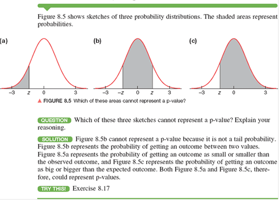
CFA CFA Level 2 p-values plotted and explained

Quant

p-values plotted and explained

Topic Resolution: Resolved
  • Author
    Posts
    • Avatar of cfyaycfyay
      Participant
        • CFA Level 1
        Up
        6
        ::

        If you were to plot p-values on a normal graph, are the p’s that are ‘higher’ than the significance level to the left (on the right tail) of the critical value, and ‘lower’ p’s that lead you to rejecting the null to the right of the critical value?

        To me, I would have thought that as you go up the x axis (further away from zero in the middle of the normal curve), values increase, but it seems with p’s the values decrease? Or am I looking at this wrong? is a p-value probability area under the normal graph or something else? I think a diagram in the curriculum plotting this out on a graph would have been a much quicker and easier way to explain p-values!

        Thanks


        hollystorm voted upZee Tan voted upSophie Macon voted up
      • Up
        1
        ::

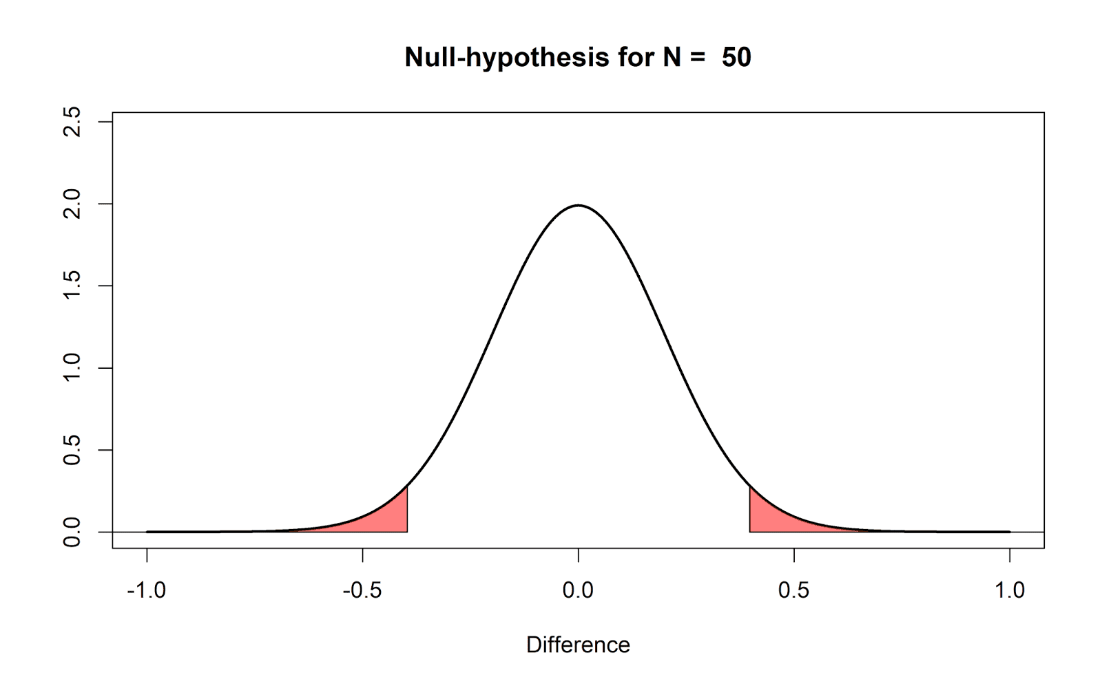
        I’m not sure if I follow your question. The p-value is not a ‘point’ in a distribution curve or axis, but rather the probability that observed results would be at least as extreme as those measured when the null hypothesis is true. i.e. that your observed results would seemingly defy the null hypothesis even if the null hypothesis is true.

        In a distribution curve, it would be represented by the area under the curve ‘outside’ of the z-value or t-value.

        A low p-value means that your observed results are unlikely to falsely reject the null hypothesis H0, i.e. your observed results are statistically significant.

        This might help (source: Data Science Central):

        p-values plotted and explained

        Sophie Macon voted up
      • Avatar of cfyaycfyay
        Participant
          • CFA Level 1
          Up
          1
          ::

          Ahhhh thank you! so it is area under the curve to the right of the observed result. Really helpful, thank you 🙂

          Sophie Macon voted up
        • Up
          0
          ::

          Sorry to muddy the waters further, but it could also be to the left of the observed result. It depends on what H0 is.

          This might help (source: Chegg)

          p-values plotted and explained

          In addition to the examples above, you can also have a two-tailed p-value like below (source)

          p-values plotted and explained

      Viewing 3 reply threads
      • You must be logged in to reply to this topic.