- This topic has 9 replies, 8 voices, and was last updated Jul-174:58 am by
 microeconomist.
-
AuthorPosts
-
-
Up::7
OK every time I pass by kurtosis I get confused, so I’m just going to write this all down here and hope the CFA gods here bail me out.
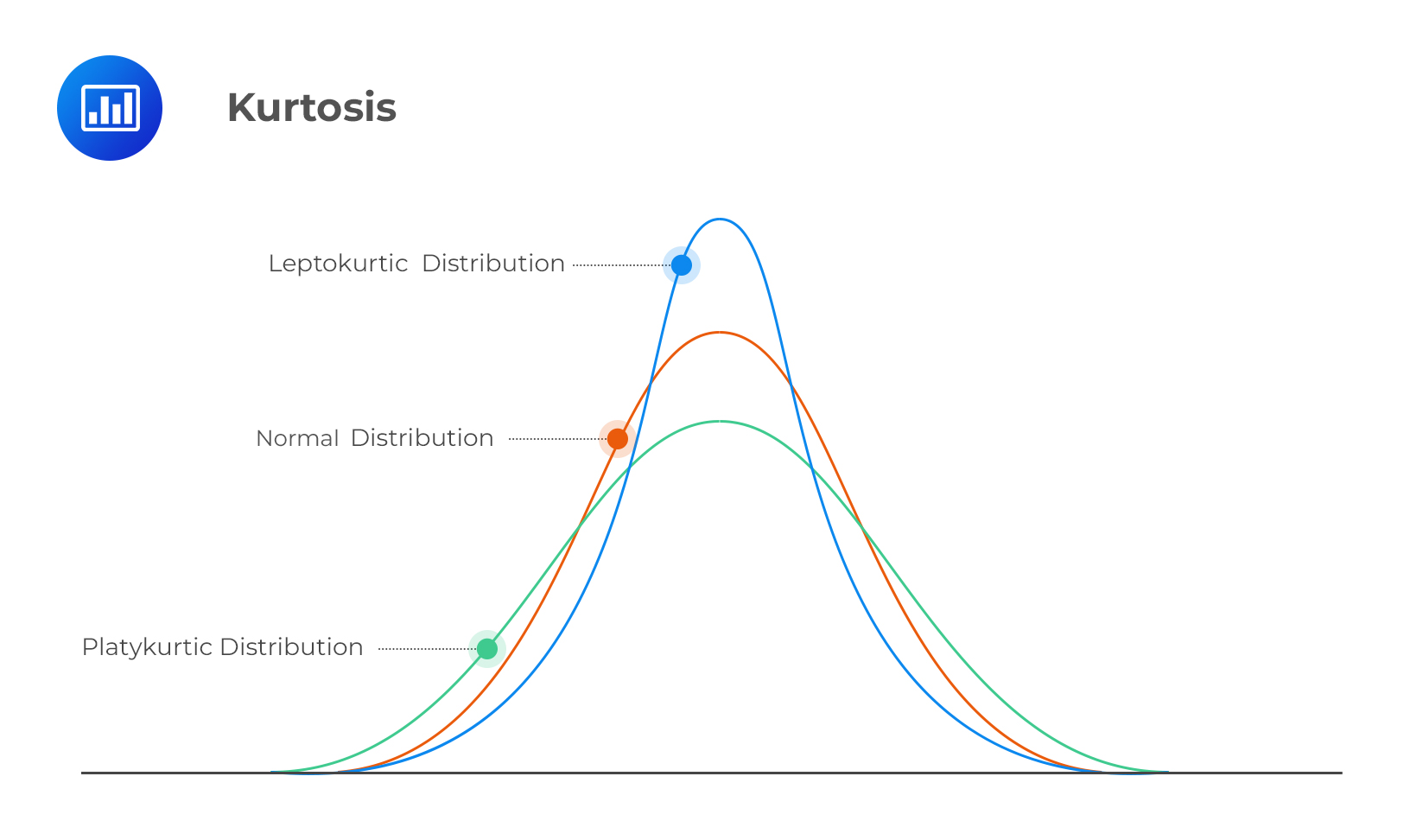
KURTOSIS refers to the peakedness of a distribution. So how ‘sharp’ a distribution graph is. OK so far.
LEPTOKURTIC (blue line) means that the graph has higher-than-normal peaks, and fatter tails than normal. Kurtosis is > 3 in this case.
PLATYKURTIC (green line) means that the graph is flatter-than-normal, and thinner tails than normal. Kurtosis is < 3 in this case.
A normal distribution (red line) has kurtosis = 3.Now my main source of confusion is the tails (the underlined parts). The books say that leptokurtic = fat tails, and platykurtic = thin tails, but how can you have fat tails with a higher peak? If most of the distribution is concentrated around the mean (high peak) then there will be little distribution around the extremes (tails), which means there will be ‘thin’ tails, wouldn’t it?
Plus from the chart you can clearly see the blue line (leptokurtic) has thinner tails than the others.
What the hell? Really hoping someone can help me out because every time I see a question that requires me to know about tails I just cry.
-
-
Up::5
@diya Excellent … I was working on this lepto and platy stuff for a while…
Nice way to remember … lepto is leaped off … Thanks -
Up::3
I just remember that leaptokurtic has leaped off the horizontal line. Since it has shifted and is more peaked it has a higher kurtosis and faster tails. Platykurtic is the reverse.
No I’m not attempting to explain, just sharing a trick on how to remember.
-
Up::3
@zee Your picture of the 3 distributions is the first and only comparison picture that coincides with the definition of leptokurtic and platykurtic distributions that I have ever seen. Why is it so hard to find another clear picture of these distributions? Just google for images of “leptokurtic vs normal kurtosis”, and I don’t think you’ll find one image that shows leptokurtic tails that are actually fatter than normal tails. Do you know of any other websites with accurate depictions like yours? Thx.
-
Up::3
@billybyte, welcome to the 3H forum!
I had to do quite a bit of digging to get a more accurate depiction of kurtosis states – usually as you say, diagrams leave off the ‘tails’ bit which creates the confusion that @hairyfairy had.
I’m sure you can find detailed insights into kurtosis in specialised statistical sites, but in a CFA context this is probably where it’s at 🙂 If you have any other questions just feel free to start a new discussion – I’m sure members will be happy to have a look, it helps everyone!
-
Up::3
” So “fat tails” is in general a terrible way of describing the ends of a distribution graph. “
Amen to that @Zee. I had to dust off my college stat text for a correct diagram (study provider FAIL). I guess some clever statistician decided to call the tail with the most area under it the “fat tail.” ….much ado about p-values.
@hairyfairy, I just remember “platy’s no fatty” <---mnemomic sponsored by yours truly and the fine makers of California Merlot 😛 -
Up::2
this was the same confusion i had as well when I was doing my level 1. Maybe the chart you have here isn’t too helpful regarding the tail part but if you look at some other charts, the leptokurtic distribution tends to have sharper peak and fatter tails (tails are ‘elevated’ from the x-axis).
A distribution that displays a positive value of excess kurtosis, or sharpness of the peak of the graph of the distribution. The graph of a leptokurtic probability distribution shows a much higher peak around the mean value, and “fat tails”, or higher densities of values at the extreme ends of the probability curve.
-
Up::2
I had this exact same problem in Level 1.
So “fat tails” is in general a terrible way of describing the ends of a distribution graph. Why do I think it’s terrible? Because it’s so completely open to interpretation, and people get the whole concept of kurtosis all wrong and confused. They draw wrong graphs which confuse the issue even more.
@hairyfairy what you’re understanding as fat tails is exactly right, and your definitions are spot on, so well done. The issue is the example graph, as @vincentt says.A leptokurtic distribution has high peaks, but doesn’t decay fast as it approaches its tails, so as it reaches the extremeties (i.e. the left and right ends of the chart), the line should be higher than normal and platykurtic distributions.
This is not shown in your chart (therefore your chart shows the tails a little inaccurately).
This is not an uncommon issue with charts showing kurtosis, so I won’t be surprised if Schweser etc got it inaccurately as well. It’s just not a point that people think about too much, but the tails are often drawn inaccurately. The right picture should look something like this:

As you can see here, the leptokurtic (high kurtosis, >3) distribution has a high peak in the centre, drops sharply down, but it doesn’t degrade that fast as it approaches the high extremeties.
On the other hand the platykurtic (low kurtosis, < 3) distribution starts off low and flat in the centre, but the degrades quickly into nothing as it approaches the ends.
Let me know if this helped or if you’re now further confused… :p
-
-
-
AuthorPosts
- You must be logged in to reply to this topic.