What can your CFA exam results charts tell you? More than you may think.
To help you get the most out of your CFA exam results, we’ve put together a clearcut guide with:
- CFA results samples,
- step-by-step guidance on how to interpret CFA results charts, and
- how you can use this to improve your performance.
Understanding your results charts can really help you in facing your next exam – use the tips in this guide and take the time to analyze your results!
- How do the CFA exam results look like?
- How to read your CFA exam results charts
- How to read your CFA exam topic performance chart
- CFA Level 3: How to read your essay and item set chart
- Got your results? Put them on your resume and LinkedIn profile, the right way.
- Help our research. Send us your results PDFs.
How do the CFA exam results look like?
CFA Institute has recently improved the transparency of CFA results reporting from 2025. Scale scores and Minimum Passing Score (MPS) will now be shown as well.
Aside from receiving a pass/fail result via email around 30-50 days after exams (see our predicted results release dates here), candidates will also continue to receive a performance by topic breakdown
This helps you interpret how well or badly you did, and use that information to better prepare for the next exam, whether you’re retaking or advancing to the next level.
CFA results first page: Results summary
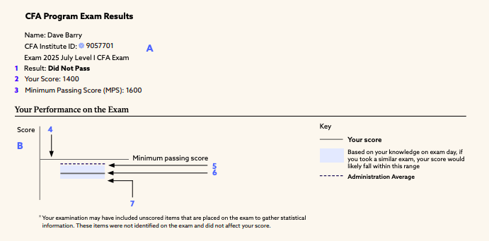
The first page of the CFA exam results PDF shows your pass/fail scaled score, as well as your overall exam minimum passing score (For CFA Level 1 it is 1,600).
CFA results second page: Topic performance charts
The second page shows your performance on a topic-by-topic basis.
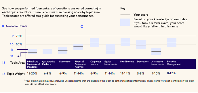
Here’s some brief explanation of the numbered sections:
- #8 shows the total available points for each topic area. Note that the points available by topic area is different due to topic weights and are not disclosed.
- #9 and #10 shows 70% and 50% of the available points in that topic. It gives a sense of strength in that topic area, as scoring consistently above 70% of the available points shows topic mastery, and if it is below 50% (including the light blue box #11 which shows the confidence interval), it probably indicates more improvement needed in that topic.
- #11 is a light blue rectangular box that shows the confidence interval for that topic area.
- #12 grey line is the actual scaled score you obtained for this topic in this exam.
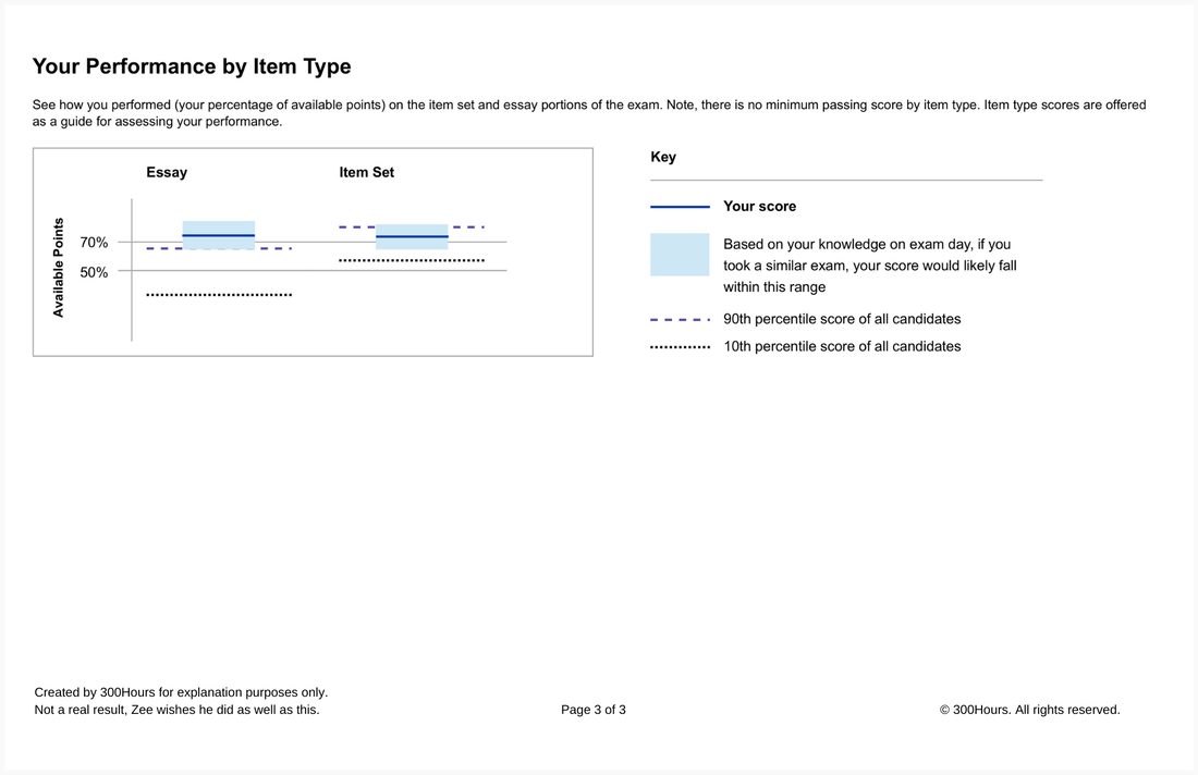
[Level 3 only] CFA results third page: Essay and item-set performance charts
If you’re receiving your CFA Level 3 results, you get a third page showing your essay and item-set performance charts.
The below is an old, pre 2025 snapshot of the actual results, which we expect the 10th and 90th percentile score will be replaced with actual scaled score and MPS details.
How to read your CFA exam results charts
Your CFA exam results chart will look something like this:
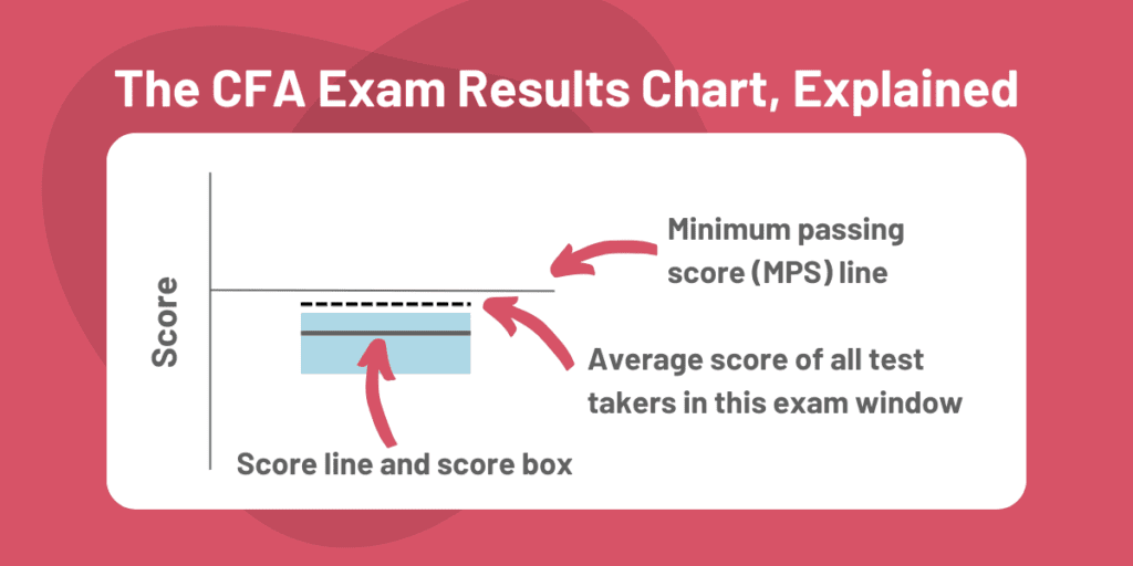
At first glance, this may just look like a haphazard mishmash of lines, patterns and colors, but it’s actually quite easy to read once you understand what the lines mean.
Let’s go through them one by one.
The minimum performance score (MPS) line
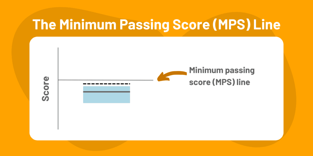
The MPS line is represented as a thin grey line on your exam results charts.
In your exam performance chart, the MPS represents the minimum score a candidate has to achieve to pass the CFA exam.
Any score below the MPS will not pass, although borderline cases might be able to scrape a pass from the ethics adjustment (more detail on that here).
The scale score MPS is now set to:
- 1600 for CFA Level 1
- 2600 for CFA Level 2
- 3600 for CFA Level 3
Your score line and score box
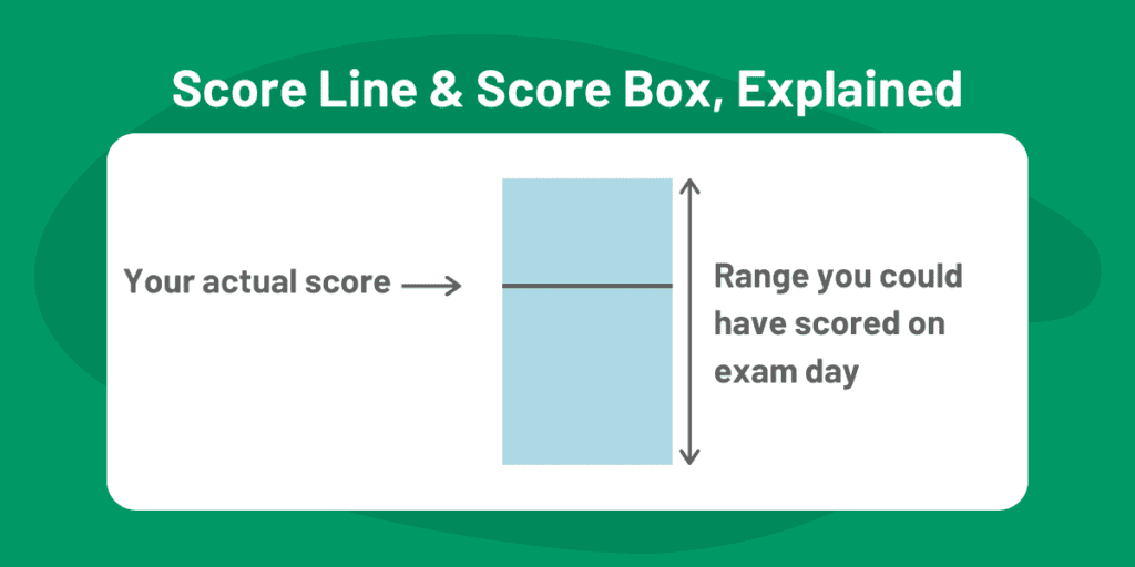
Your score line represents your score in the actual CFA exam. A score line below the MPS line means you failed, whereas a score line above the MPS line means you passed.
The score box brings it one step further – CFA Institute reasons that your score line represents only one snapshot of your performance and level of preparation.
The score box is therefore CFA Institute’s estimate of your performance given different sets of circumstances, such as:
- The actual exam topic mix favored, or did not favor your topic mastery
- Your state of rest and alertness during the exam
- Lucky or unlucky guesswork
- Actual exam conditions
The top part of the score box represents an estimate of your ‘best-case score’ if all factors went your way, whereas the bottom part of the score box shows your ‘worst-case scenario’ if all factors for you, well, sucked.
The average candidate score line
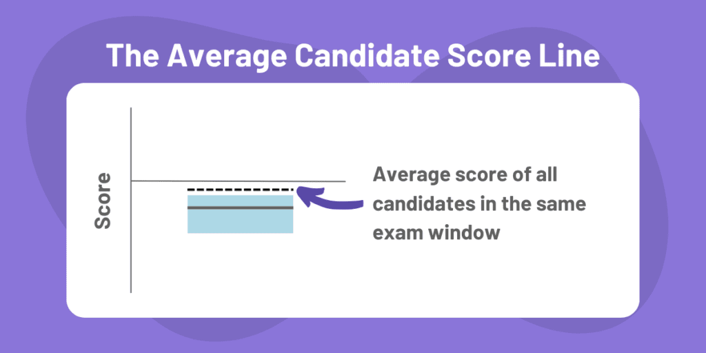
To give additional context, CFA Institute also show where the average score of all candidates for that particular exam window.
This allows us to compare if we performed above or below average with the same cohort by comparing it with our actual score (thick grey line within the light blue score box)
Reading and interpreting the CFA results chart
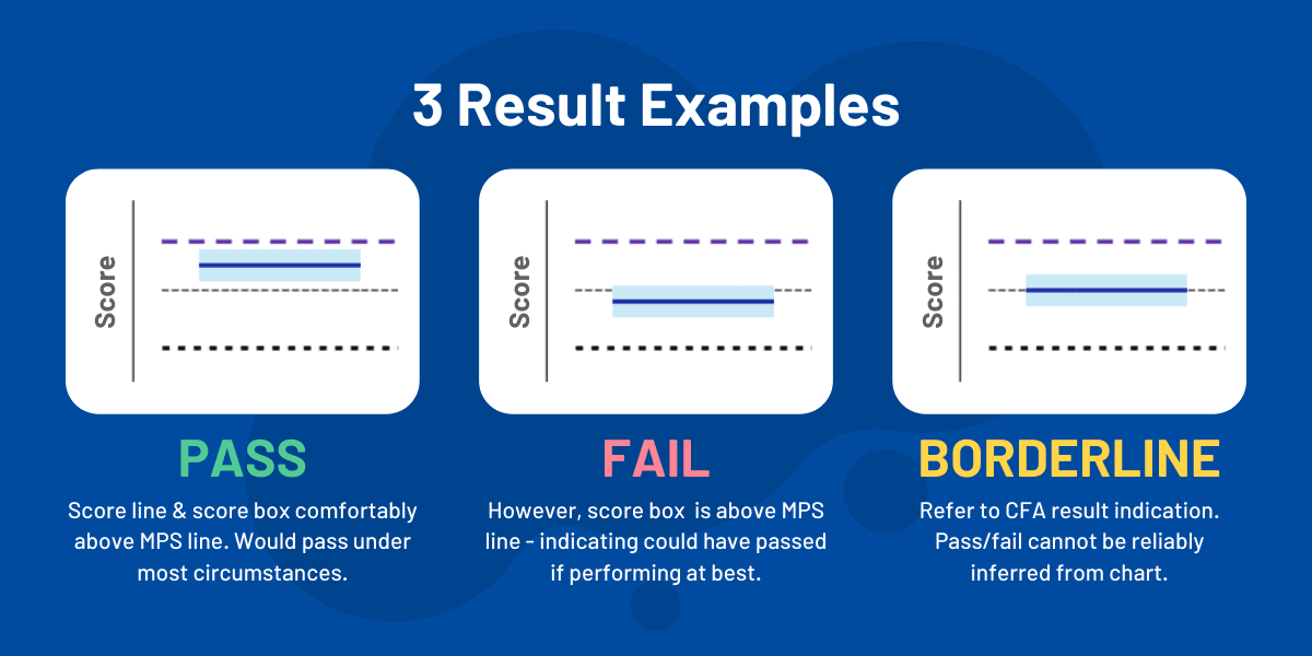
The image above shows the three basic cases how your results might look like.
Interpreting the lines on the chart is quite simple:
- If your score line is above the MPS, you passed.
- If your score line is below the MPS, you failed.
- The higher the score line, the better you did in the exam.
The chart is just to illustrate your relative performance – the final pass/fail result is stated clearly on the first page.
You probably would have noticed from the charts that the y-axis doesn’t actually have values, so unfortunately you don’t know what the MPS is, nor your actual score.
(We’ve estimated the MPS for every CFA exam since 2012 though, in case you’re curious.)
How to read your CFA exam topic performance chart
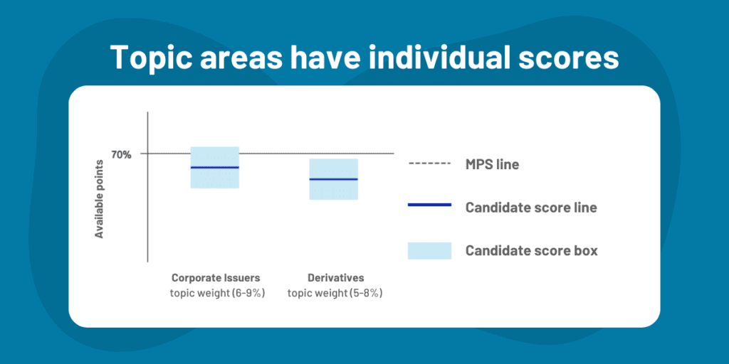
Looking for guidance on what CFA exam topics to focus on? Your topic performance chart can show you a wealth of information if you know how to interpret it properly.
Here is an example of a topic area performance chart, and our analysis:
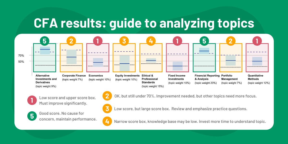
How can you analyze your own results charts? Pay attention to these metrics below.
The 70% line and 50% line
There is no minimum passing score for each topic area, so CFA Institute shows a 70% line as a reference point – representing 70% of available points for that topic.
According to CFA Institute, ‘although this level is somewhat arbitrary, consistent scores above 70% of the available points is a reasonable signal of topic mastery.’
Recent results also includes a 50% line, although this has varied across the years – some years did not include a 50% line.
Our analysis into previous MPS scores also tell us that if you reliably score above 70% for all topic areas, you should expect a passing score – although there are obviously no guarantees.
Pro tip: Assess your score box size
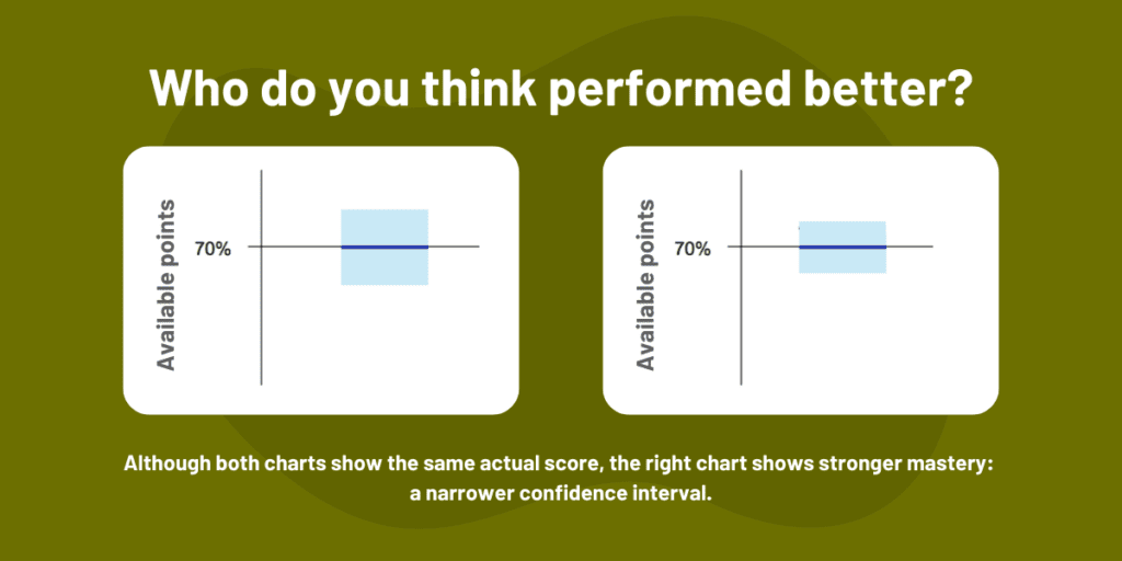
Wider score boxes (i.e. confidence intervals) mean lower consistency.
You’ll also notice that the score boxes in the topic area charts are a lot wider than in the results chart.
This is naturally due to fewer questions per chart (i.e. smaller sample size), and sometimes with a wider dispersion of responses.
Looking at the chart above, although both score boxes show the same score, the score on the right has a narrower confidence interval and therefore performed better than the score on the left.
How to identify topics to focus on and ways to improve
By evaluating your own score, your score box, and the scores of other candidates via the 90th and 10th percentile lines, you should be able to identify the topics you did well in, and the topics you should focus on, and HOW you should work on them.

Going back to our initial example, we see low-performing topic areas, but for different reasons. Corresponding to the numbers in the chart:
- The actual score line and upper end of the score box both did not perform well in either the absolute scale or the percentile scale. Improvement is needed significantly.
- These were the best performing topics, but the score was still significantly under 70%. These do need to improve, but other topics need focus first, especially since these are lower-weighted topics.
- This had a low score, but a large score box. This suggests that the candidate could have performed well in this topic area. Recommend a quick review and emphasize focus on practice questions.
- Low and narrow score box – suggesting that the candidate would consistently perform poorly here. The implication is that base knowledge in this topic is low. Need to invest more time to better understand topic.
- Good scores in these topic areas, with high consistency. Maintain your performance here and you should have no problems.
Hope the examples above help you understand your own chart!
CFA Level 3: How to read your essay and item set chart
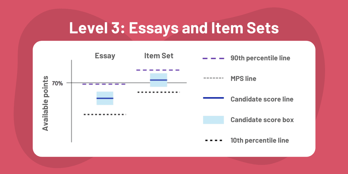
In the Level 3 exam, the exams are divided into structured response (‘essay’) and item-set questions.
CFA Institute has also indicated that their results details will include a performance chart split by item type, so that you can compare your performance and see whether you were a stronger performer in the essay paper, or the item-set paper.
Our own analysis on exam data has shown that candidates are highly likely to perform better in the item-set paper.
Got your results? Put them on your resume and LinkedIn profile, the right way.

Want to flaunt your new CFA status professionally? Read our definitive guide on how to update your CFA status on all professional communication, including your CV/resume and LinkedIn.
Help our research. Send us your results PDFs.
If you’d like to help us better understand the results format, just send your results PDF to results@300hours.com.
We understand the trust that you are giving us when you do so, and will not be sharing your information with anybody else, and will only use it to perform anonymised analyses that continue to help present and future CFA exam candidates.
If you’re expecting your CFA exam results soon, good luck! If you have any more questions on understanding your results, just pop them in the comments below.

Good day Zee
I would like to register for CFA, i am from Lesotho, i have studied CA Lesotho with 3 years of experience. What are the requirements to register.
Warm Regards
Hi Halieo, welcome to 300Hours. See this for entry requirements for CFA registration, and a more general requirements of what you need to become a CFA charterholder. Hope these help
CFA has the WORST scoring method the world. If this method is to make themselves think they are an “elite” organization, they are mistaken. This is just a mockery of how exams are scored. In irony, the confidence box is horse poo- no confident in it that is it accurate based on how I actually feel on each topic area. I will just suggest, if you score below below 70%, study! Stop using some imaginary blue box. You should aim to score more than 70% in each area to pass Level II. Better yet, not sure why they can’t just give candidates their actual score instead of this nonsense they came up with. I just hate this organization. Once I get the CFA, I want nothing to do with them. Dont even get me started on their rude customer service and website that is so user-unfriendly.
Hi,
I didn’t receive the 3rd page for my level 3 explaining the essay and item set. Any thoughts on why CFA removed this page?
Thanks!
Hi,
You didn’t receive the 3rd page, but the 2nd page with the performance per topic you received normally, right?
Thanks
Hi Zee,
I got my Nov 2021 Level 3 result, but I don’t have the 3rd page showing breakdown of essay and item set. Wondering if they changed format. Thanks.
Can we get the papers of CFA level 1 of previous quarters/ years?
Hi Agam, unfortunately CFA Institute does not publish previous exam papers.
Thank you Zee.
Quick question: do you know if the overall exam result chart is to scale?
I.e., if I used a data tool to try and back out what my exact percentile was, would I actually get an accurate reading?
Very random I know, but curiosity killed the cat.
Thanks!
It seems to be to scale. It wouldn’t make sense to show relative 90th and 10th percentiles otherwise if the distance between lines mean nothing.
how can the pass rate for May level 1 exam be as low as 25%? seems ridiculous to me
The cohort for each exam is different, and the content for each exam window is different, so it’s possible.
In theory, the MPS shows how hard/easy the exam is (high MPS = easy). And also in theory, the pass rate shows the average candidate quality of each exam cohort (high pass rate = high quality).
So I would say with the numbers as they stand, and assuming CFA Institute’s methodologies on pass rates and MPS are as they say, this points to a lower average candidate quality for the May’21 CFA exams.